Onboarding Widget
Our analytics showed a significant drop-off after registration, especially when users encountered the KYC verification step. Many users either hesitated to start the verification process or did not understand their current KYC status.
We identified several key problems: after registration, users often felt lost in the app and did not know what actions to take next; users were afraid of completing KYC, assuming the process would be complicated or risky; and users did not understand their current KYC status or what step they needed to complete next.
To improve activation and reduce friction, we needed to guide users through the first steps of the product with a clear, step-by-step onboarding experience.
Our main insight from analytics was that user churn increased after introducing mandatory KYC, which meant we needed to redesign how this process was communicated and integrated into the product.
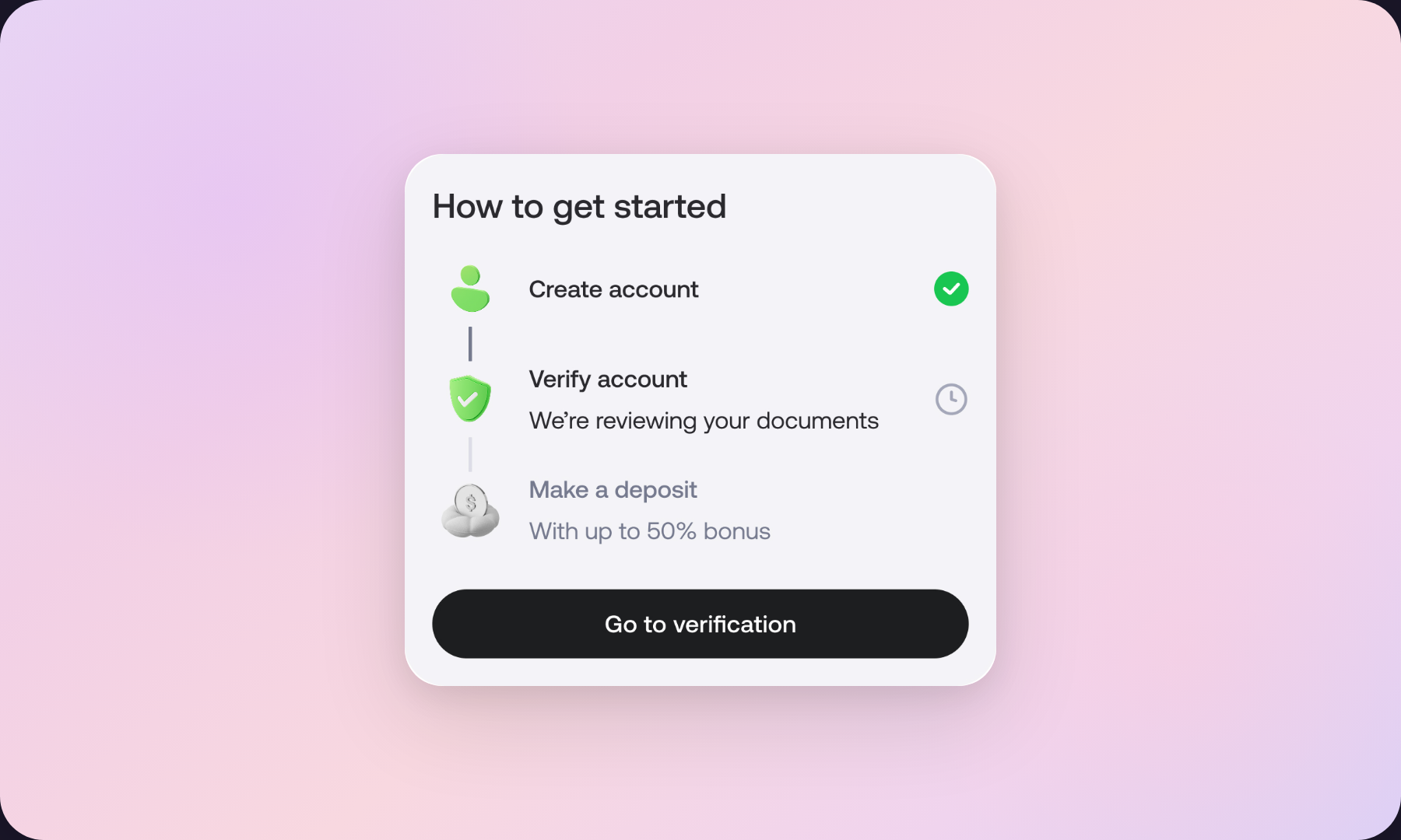
First, together with the Product Manager, we defined a list of key activation actions that users should complete early in their journey. These actions included the most important onboarding steps, such as account verification and initial setup tasks.
Next, we collaborated with the back-office team to identify all possible KYC statuses that could appear in the system. This step was critical because verification could exist in several different states depending on the user's progress and document validation.
After collecting the full list of statuses, I worked together with a designer to map and design all possible UI states for the onboarding widget, including: not started, in progress, and completed. Each state required its own clear UX copy and visual representation so that users would immediately understand what was happening and what action was required from them.
A key part of the work was ensuring that no corner cases were missed. We carefully reviewed every possible status combination to guarantee that the widget would always display the correct message and next step for the user.


The onboarding widget created a clear activation path for new users, guiding them step by step through the most important actions in the product.
Instead of leaving users to explore the interface on their own, the widget showed what action should be taken next, clarified the current KYC status, and reduced anxiety around the verification process.
This approach helped transform a potentially confusing onboarding flow into a structured and supportive user journey.