Debit Account Redesign
The debit account screen had been growing for years and it was starting to show. Adding new features was getting painful, and users kept contacting support to find things that should've been obvious.
We looked at what people were actually asking support about, talked to users, and dug into analytics to see which parts of the screen were confusing people most.
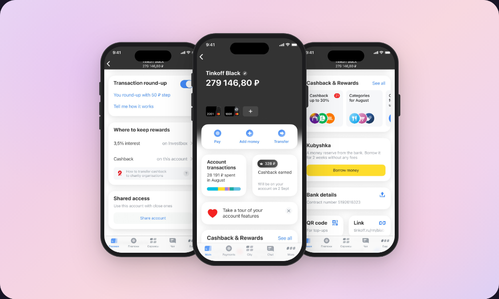
We moved to a widget-based layout — modular blocks that could hold a specific setting, piece of account info, or product offer. Flexible enough to reuse across loan, savings, and investment accounts too.
All copy was rewritten from the ground up. New features brought new edge cases, and each needed careful thought — especially moments where users might feel unsure or make an irreversible decision.


Support questions about cashback dropped right away — the balance was now visible at a glance. Built-in onboarding helped users find their way around without friction.
The modular structure paid off quickly. We launched Kubyshka — a fee-free short-term borrowing feature — as a native widget in the same release. It got genuinely good feedback from users.